Mortal Quilt Project Update
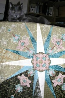
 Here’s the state of the project I started in the “Mortal Quilt Update”. I think it is ugly. It’s an interesting ugly case study. I either like or love all of the fabrics. I love the central William Morris medallion in the center of the star. I love Mariner’s Compass variations. I like the idea of combining hard-edge piecing of little triangles with the appliqué. The hand appliqué was done competently.
So why is it ugly? I think that there is not enough contrast. This is an ongoing design challenge I have with my beloved William Morris fabrics. Most of them tend to be a medium value. I have few, if any, light or dark values in my Morris collection.
I think also that the goal of making a definitive quilt is a very high bar, indeed. This certainly falls way short.
I am a “finisher”, in general. There are very, very few UFOs (unfinished objects) in my closet. I think this piece has a future as a reasonable wall quilt with some more work. But I need some time to think about it. So it will “cure” or mature in the closet for now.
Regarding this piece, if I had done a traditional Mariner’s Compass I’m sure I could have delivered a knock-out blow. I’ve done a very nice Mariner’s Compass quilt. It was my wedding quilt. I am glad that I experimented, though.
I’m interested in any design suggestions regarding this piece.


Comments
Good luck I am sure you will think of something that will be beautiful!